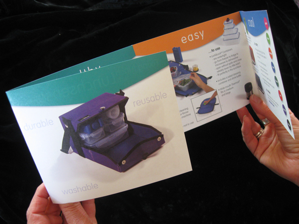
Lunchsense Brochure
Lunchsense Brochure
Brochure
Client: Lunchsense
The construction and design elements of this brochure are intended to echo the form of the lunchbox product itself. The way the reader unfolds the brochure is very similar to the clever way the lunchbox itself unfolds into a placemat. The “tab” headers on each panel are reminiscent of the flaps on the lunchbox. The white space and sparse design reflect the elegant functionality of the lunchbox design. The idea is to give readers an experience with the brochure that corresponds to the one they would have with the product.


